Case Study
Adeptina
Branding transformation for leading neurodivergent executive coaching business


Objective
Adeptina was formed by Tina Squire, drawing on her experience in the corporate sector at a senior level and training as a coach, to support professionals in managing their environments without unnecessary stress and anxiety. In the wake of her ADHD diagnosis and new-found knowledge and passion to find out more, Tina pivoted her business to support other neurodivergent professionals within the corporate world.
As a result, Adeptina had outgrown its previous branding and needed to reflect their newly niched offering while also expressing the wealth of expertise that Tina and her team offer. Choosing Studio Bifrost was a logical choice for Adeptina, as our founder, Jenny Fox, has ADHD and is well aware of the challenges Tina and her team help their clients manage.

Creative
Adeptina is one of only a small number of providers who straddle the executive coaching and ADHD coaching markets to specialise in executive neurodivergent coaching. Our research found that the majority of executive coaches use text-only or monogram logos compared to those who use logos containing an icon. There was a relatively even split among the few executive ADHD coaches found, while most ADHD coaches use icons and a third opt for text only or monograms.
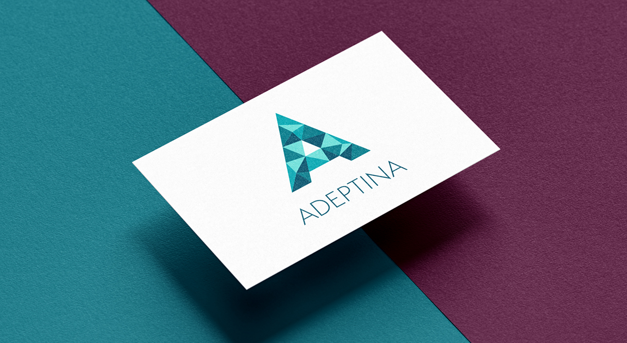
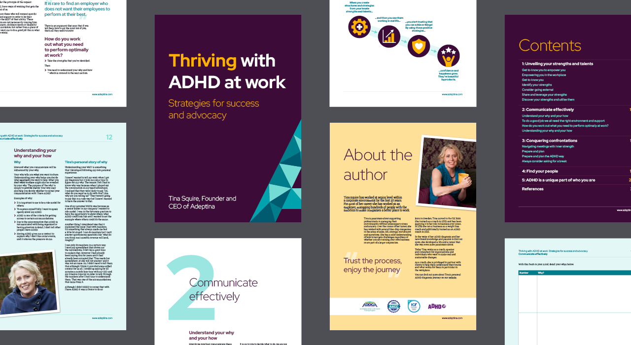
Therefore, to position Adeptina among executive coaches, the logo has been designed as a monogram. The A of Adeptina has many positive connotations – for example, being the best, A for agile, A for action. A capital A also looks like a mountain or an upward pointing arrow. It also feels strong and stable, encouraging trust.
The A consists of a series of irregular triangles. They represent the variety of unusual skills neurodivergent individuals have. The different shades of teals and turquoises give the A a crystaline feel, which gives the sense of a precious stone, of diamonds in the rough and the high quality support Adeptina provides. Teals give a sense of positivity, growth and calm.
I had an incredible experience. I appreciated how Jenny took the time to explain the process clearly. This allowed me to understand the reasoning behind every decision and gave me confidence in the final product. My ramblings were effortlessly translated into a design that surpassed my expectations. Studio Bifrost delivered exactly what was promised, and I couldn't be happier with the results.
Tina Squire
CEO, Adeptina

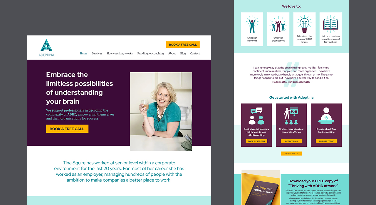
To ensure a consistent look, we chose the accompanying typefaces alongside designing the logo, meaning we could create the A in the logo from the headline text typeface.
The chosen headline sans serif typeface is clear, precise and practical, as well as being in line with the strong trend in ADHD and executive coaches for sans serif typefaces. The slants on the ends of the strokes, e.g. lower case b, h and d, add interest and personality. Using bolder weights gives a chunky, dependable look. We've selected a practical and contemporary feeling slab serif typeface for body text.
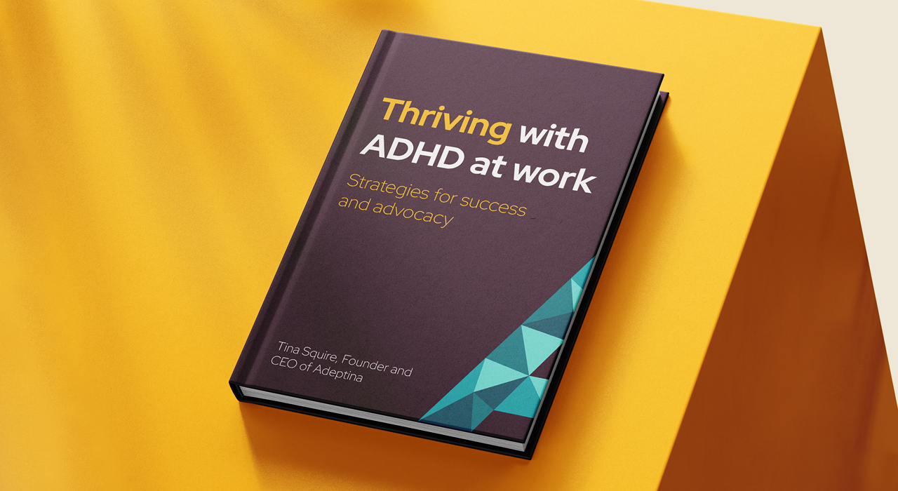
The colour palette combines the lightest and second darkest teals with rich, aubergine purples. Purple is a colour commonly used in the ADHD and neurodivergent services market, so including it aligns Adeptina with that market. Using deep, rich tones gives a classy and high-quality look. A golden yellow adds a further sense of high value as well as a bright splash of energetic colour.
The website has been designed to break down the information into manageable chunks – which is vital for any website, but even more importantly for busy, neurodivergent professionals who are overwhelmed and in need of support! We utilised the contrasting colour palette to direct users around the site and towards the e-book lead magnet, choosing “Golden Opportunity Yellow” in the visual language to indicate interactive objects.
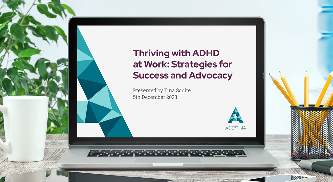
Across the website and e-book, negative space and flat colours create a premium and modern look, to encapsulate Adeptina's niche position as a executive neurodivergent coaching service.

Result
Adeptina is delighted with its new visual look. The branding style has been set out in a guidelines document. It will be used for all communications materials from now on. The new branding supports Adeptina's repositioning in the neurodivergent executive coaching market. This also places Tina Squire as a leading voice in the neurodivergent arena, allowing her to pursue speaking engagements.