Case Study
Intelligent Decisioning
Group rebrand for well-established digital transformation partner


Objective
Intelligent Decisioning are a digital transformation partner for a diverse range of clients, including the NHS, the National Portrait Gallery and Sainsbury's. Having been established over 15 years ago, their branding had grown organically, with sub-brands for their intranet (Mercury) and document management (docCentrum) products. However, like other organisations who have scaled up their branding with their offering, this had resulted in a disjointed look that needed refreshing and consolidating. Studio Bifrost were commissioned to overhaul the look for the whole family of brands and provide website design in the new style.


Creative
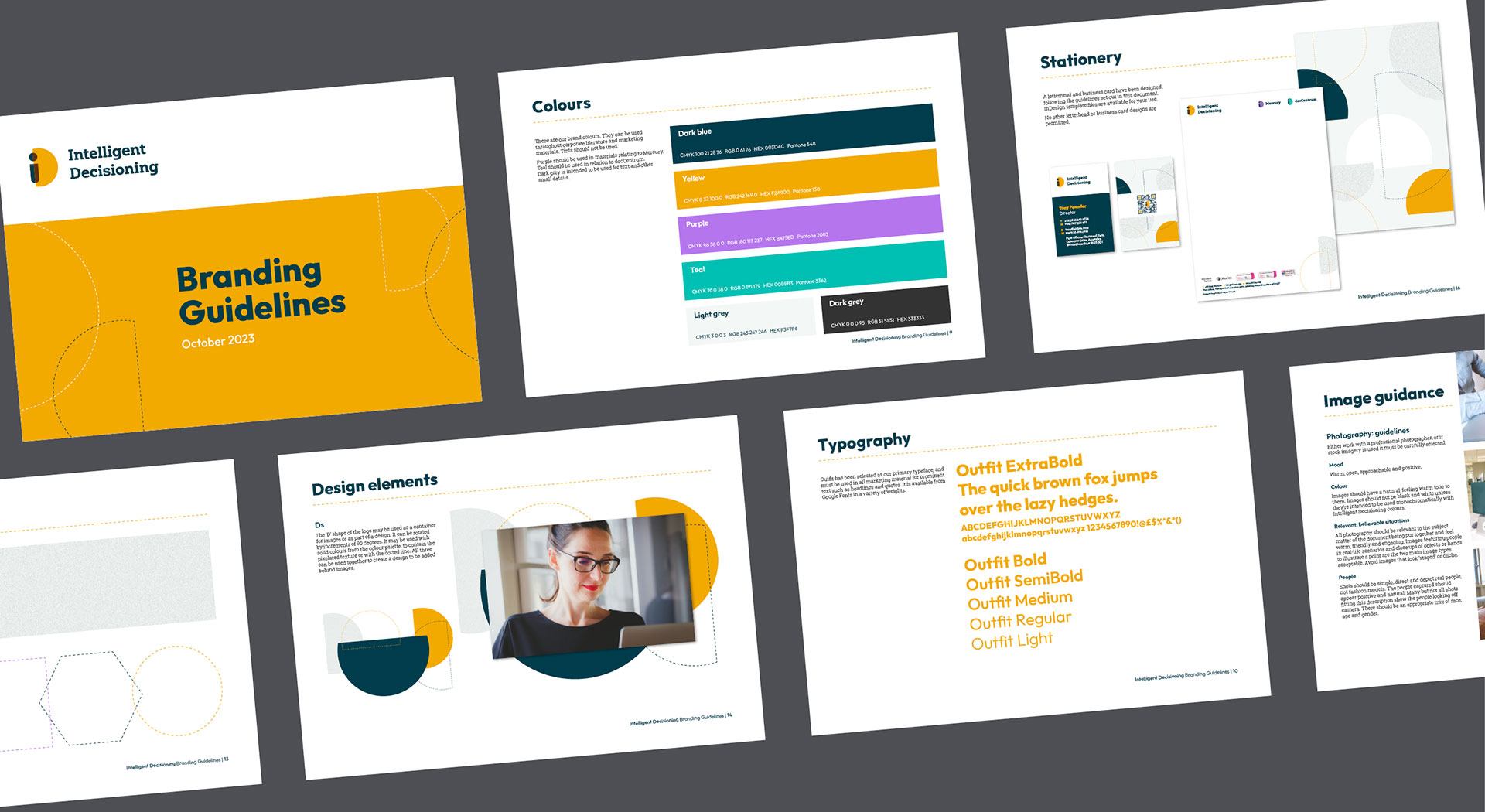
We leveraged brand recognition from their old logo, which contained yellow circles, to create a modern monogram, to imply quality and expertise, based on circles. The face created by the lower case i and upper case D, and the lower case i appearing like a person connote Intelligent Decisioning’s personal approach and benefits to each individual within their client’s organisations. The slightly transparent nature of the i over the D gives a sense of movement, progress and flexibility, reflecting Intelligent Decisioning's tailored approach to IT solutions.
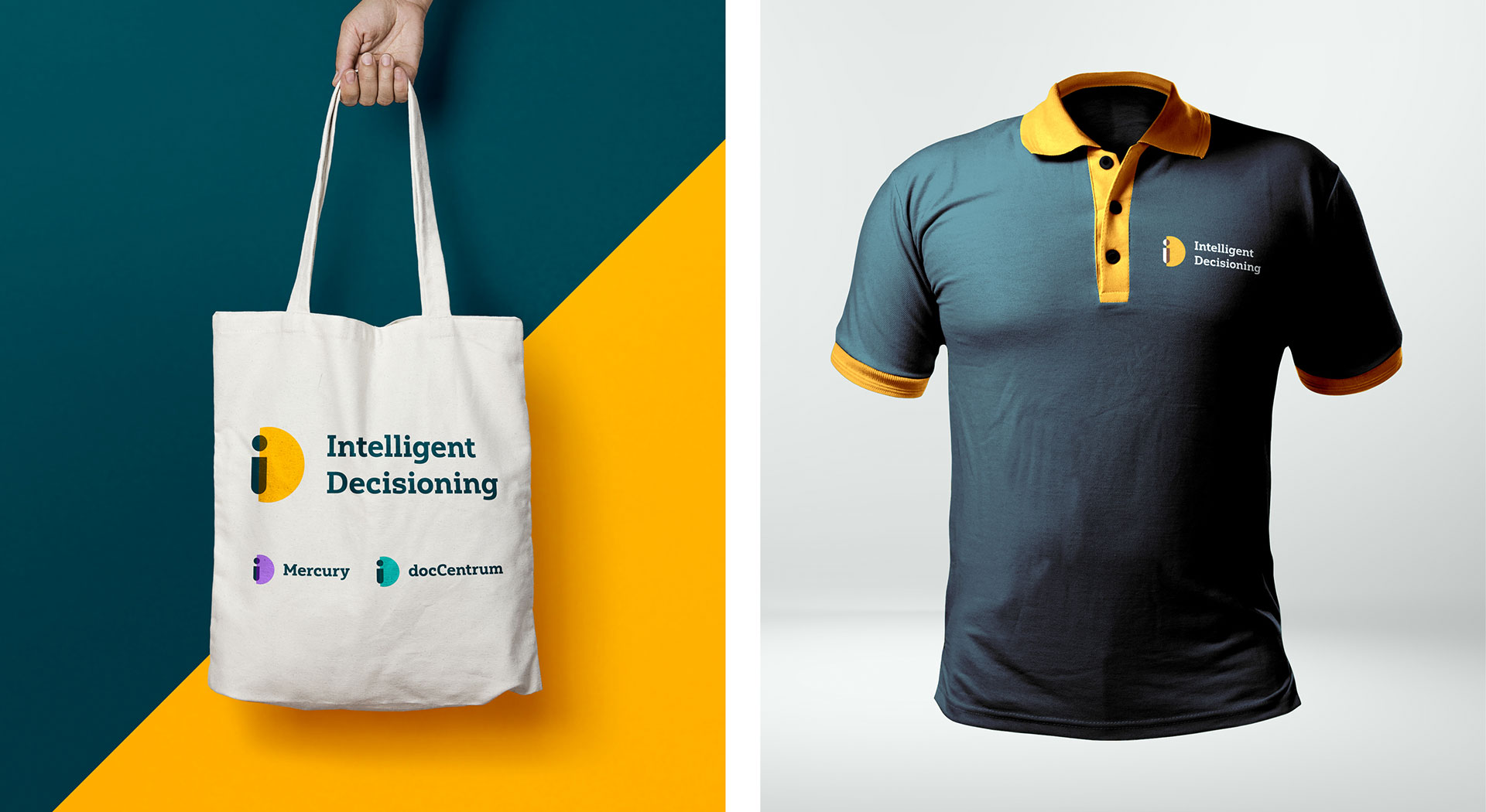
Mercury and docCentrum have been included in the Intelligent Decisioning family by using the same icon, with different colours. Our competitor research revealed that yellows and oranges are amongst the least utilised products, so choosing a shade of yellow for the overarching brand simultaneously encourages brand recognition and helps set Intelligent Decisioning apart. Purple was selected for Mercury as it is warm, approachable and reflects the enhanced interpersonal connections experienced by clients who purchase the intranet solution. As security is a key feature of docCentrum, we explored shades of green to give a sense of safety and positivity, and chose a teal. These rich, vibrant and energetic shades have been paired with a calm, precise and formal dark blue.
From the outset, Jenny set clear expectations and maintained open lines of communication and was open to discussing ideas, providing updates, and incorporating feedback. Studio Bifrost brought creativity to our brand's core values and the quality of work delivered was top notch. I'd recommend Studio Bifrost to any organisation looking to make a significant impact through design.
Tony Pounder
Director, Intelligent Decisioning

The clean, simple branding style we have chosen gives a sense of logic, clarity and ease of working with Intelligent Decisioning. A bold, geometric sans serif typeface has been chosen for headings to emphasise that feeling of clarity, while a slab serif has been chosen for body copy to give a solid, trustworthy look. The D device from the logo can be used across materials to add splashes of colour. We added a pixel texture and dotted lines to the branding palette to hint at Intelligent Decisioning's attention to detail and planning ahead for their clients.
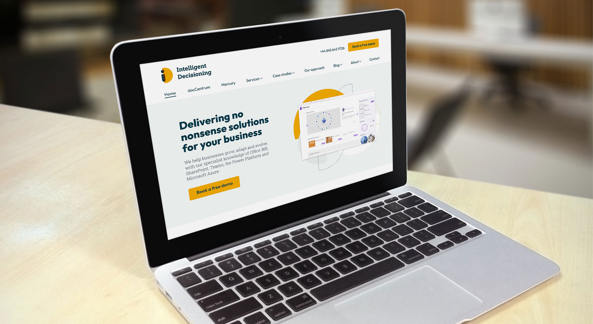
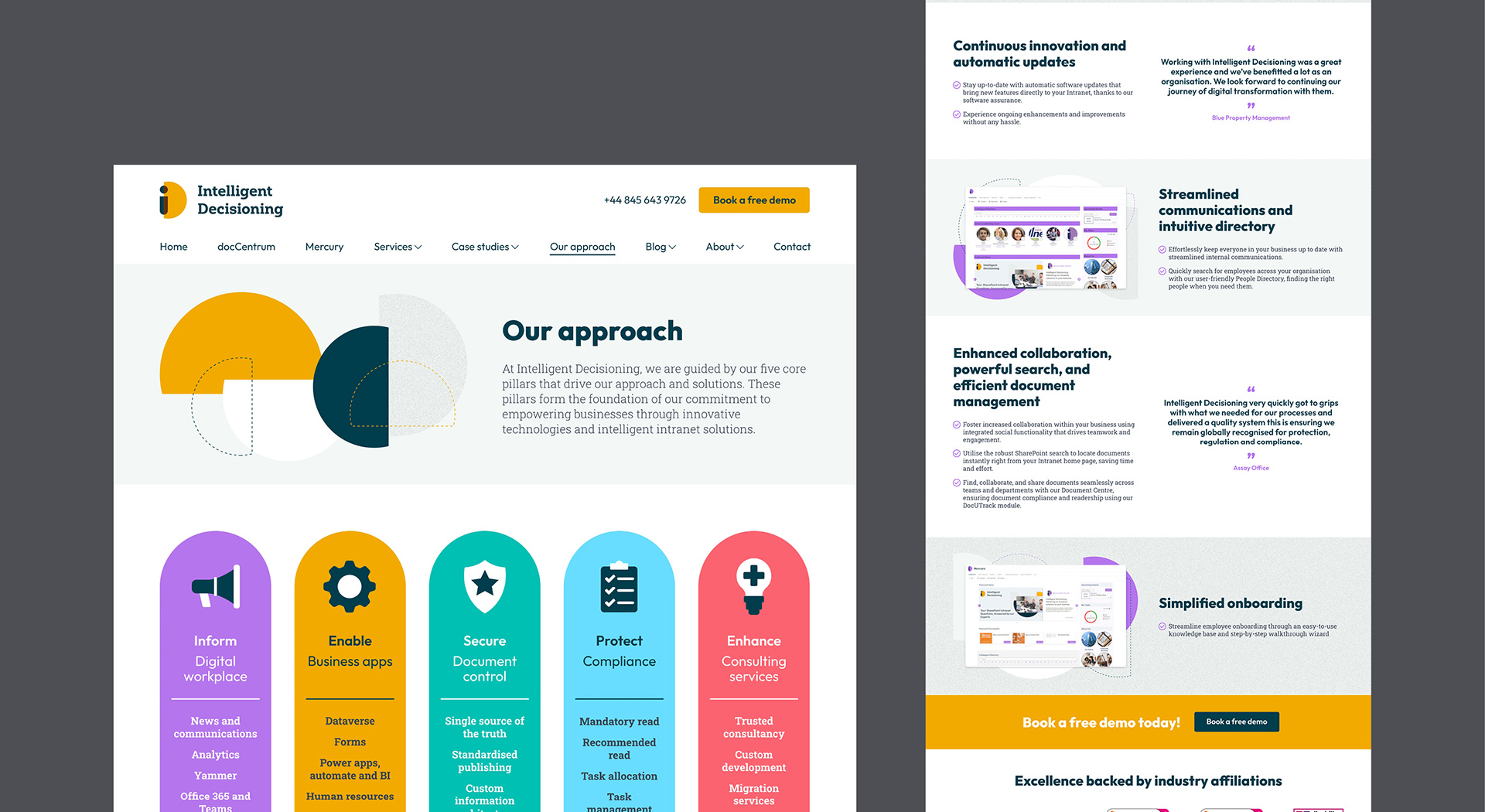
The website design provided an opportunity to explore the new visual style while we created the guidelines, including chart and icon design. In Intelligent Decisioning's highly competitive market, it's vital that their website is easy to navigate and provides a seamless flow of information to encourage users to convert to clients, so we approached this by thinking about what problems their client base may have and how Intelligent Decisioning would solve them.

Result
We delivered branding guidelines that will form the visual basis of all future branded materials. This is part of a larger marketing strategy to consolidate Intelligent Decisioning's growth to date and provide an opportunity for further growth. At the time of writing, Intelligent Decisioning are working on the next stage of their marketing plans, and Studio Bifrost will be asked to provide further visual assets to support those plans.