Case Study
The RU Group
Full service collaboration, visual branding across all marketing materials


Objective
With over £600m of assets under their management, financial advisers The RU Group are committed to delivering a high quality, personalised service based on intelligent insight. In a crowded marketplace moving away from the traditional, staid messaging, it was important for RU's proposition to set them apart from other experienced competitors. RU were keen to expand their client base within the East Midlands and beyond. Developments in the industry saw interest in ethical investments grow, so it was imperative RU positioned themselves as market leaders by staying ahead of the curve talking about these and other pressing matters as they arose. Covid-19 brought stock markets and investments crashing down, sending the media and investors into panic. RU then needed to engage with clients to reassure them.

Creative
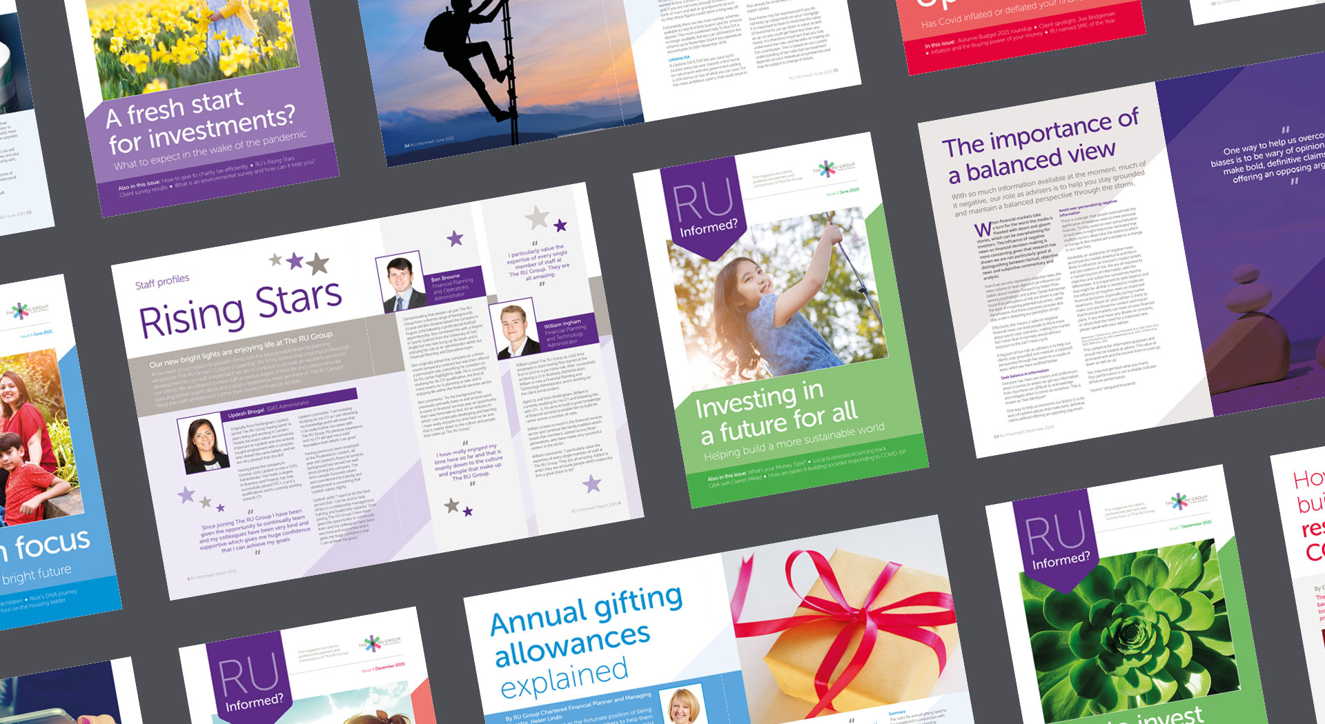
To enhance appeal and engagement with their target audience, the newsletter was redesigned to become a full magazine complete with features such as client spotlight, tips and advice based on the latest governmental budgetary changes, lifestyle and personal stories from RU staff. In The RU Group's client survey, 83% of agreed RU Informed adds value to their relationship with RU, with a client commenting "It is comprehensive, interesting and well designed and produced.".

We love the style and design evolution that Jenny has encouraged. Instinctively she seems to be able to interpret our vague ideas and concepts and bring them to life. She is a pleasure to work with and also makes sure things get done!
Ian Browne
Head of Advice, The RU Group


The RU Group's calming branding style and messaging reassured clients through regular communications that the performance of investments should be viewed over the long term. This was particularly important during Covid when the stock markets were volatile and national press featured panicked headlines.
The font choices were refreshed from the original guidelines to retain the headline font and maintain a link with the logo, as it gives an assured, approachable feel. An additional sans serif was selected as a more legible and practical choice for body copy, while underpinning a sense of professionalism.
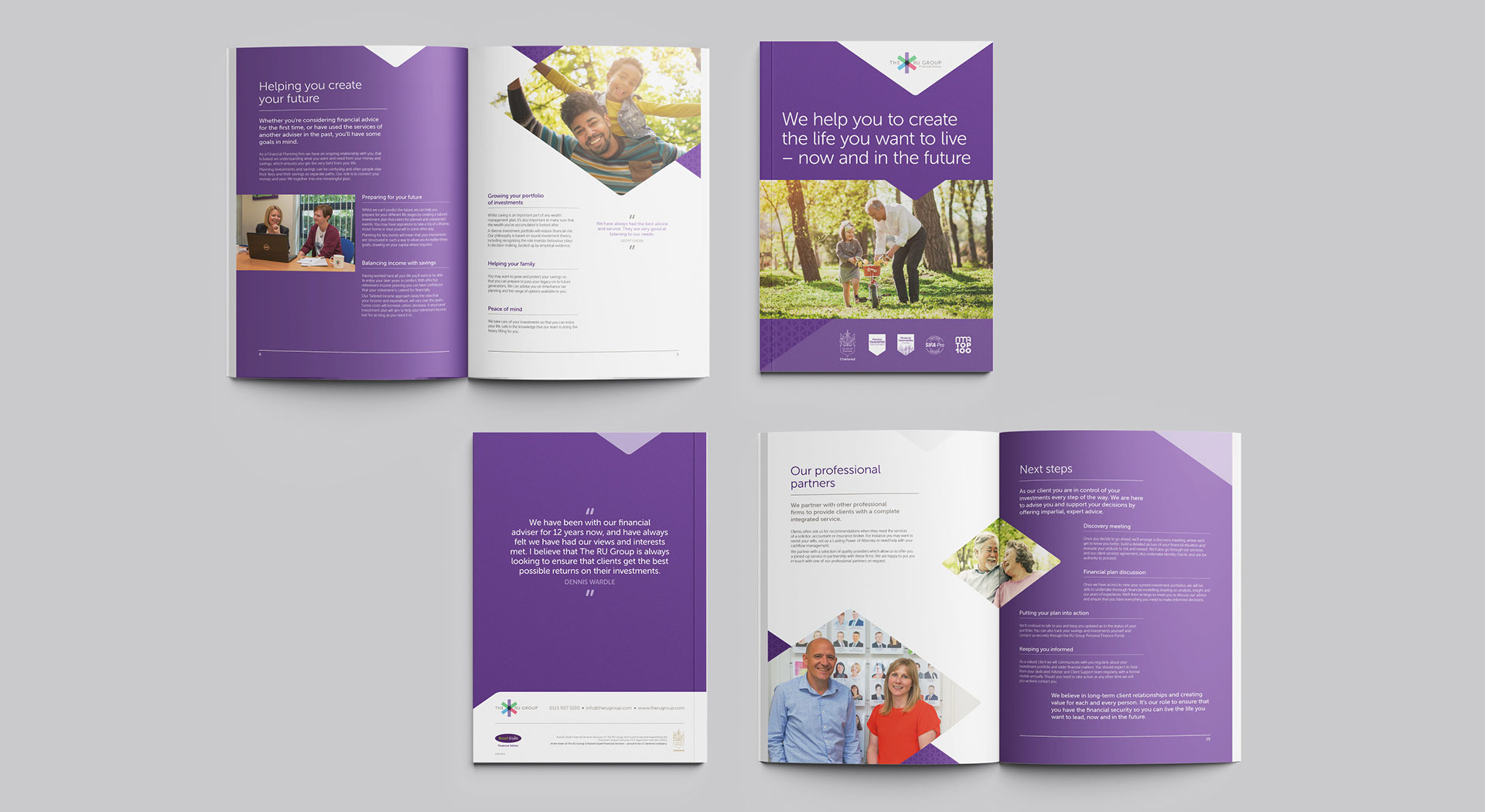
The colours were taken from the logo to add warmth but offset with the grey for contrast. The 35 degree angle has been adopted from the logo and used throughout as a vehicle for colour, imagery and the pattern. The pattern has been created by joining and repeating the star icon, alluding to partnership and support. These elements are carefully layered to balance impact and texture with professionalism and visual hierarchy.
RU's imagery is a mix of commissioned photography, showcasing the people of RU in a natural style and real relationships clients can expect to make with them, with carefully selected stock images which represent clients enjoying the benefits of investing wisely with RU.


Result
After initially engaging with The RU Group on their newsletters, we have enjoyed a long-standing, close, retainer relationship developing their branding style, messaging and presence across all touchpoints. RU's prime audiences were defined as wealthy 'fit fifties' making their investments count, as well as those transitioning to retirement and the years beyond. Given RU's friendly approach, a family feel was chosen to strike a chord emotionally. A new brand guidelines document was then issued and internal and external collateral were updated to give a consistent look. Studio Bifrost was commissioned as brand manager to ensure all communications adhere to the new guidelines.
RU became a sponsor of Nottingham Rugby and won SME of the Year at Nottinghamshire Live Business Awards 2021 (our colleagues at RedTree PR created and submitted RU's entry on their behalf), helping to keep them front of mind in their target audience and positioning them as experts in their field.