Insights 27 OCT 22
Jargon busting for clients: images
Are you unsure if the images you’re supplying to your designer are big enough? Are you confused by CMYK and RGB? Do you know what DPI is? Bifrost Founder Jenny Fox blasts through the jargon with some top tips.


What are CMYK, RGB and Pantone?
You might have heard designers talk about CMYK, RGB and Pantone. These describe what colours are used to make images.
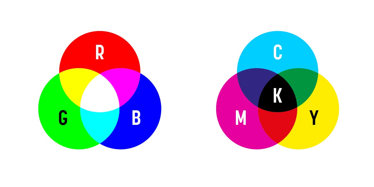
RGB is Red, Green and Blue. It is an additive colour model, which means it uses light to create the colours. It is how colours are displayed on screens. If you look very closely at an old TV screen or monitor, if you have one of those around, you’ll be able to see red, green and blue dots. White is the combination of all three primary colours and black is the absence of all primary colours.
CMYK is Cyan, Magenta, Yellow and Key aka Black. This is a subtractive colour model. This means the colours are made by reflecting light. CMYK is for printed colours because they are created by the light reflecting off of the ink. If you look closely at printed images, you may be able to see the tiny cyan, magenta, yellow and black dots used to create the colours.


Lost in translation?
The different ways colours are created on screen and in print are the reason why it’s difficult to precisely replicate colours in print from what is seen on screen. Colours printed in CMYK tend not to be as bright as colours shown on screen in RGB. If RGB colours are printed, they tend to look duller and more flat than they do on screen. It’s therefore important to ensure images are sent to print in CMYK format. This is a job for your creative as they can convert photography from RGB to CMYK (or the other way if needed for screen) and make any necessary adjustments to make the colours appear as bright and clear as possible.
If you’re supplying a logo or other brand-specific images, providing images in the right colour format is important for maintaining colour consistency. For example, if you provide a logo in RGB and it needs to be printed your designer can convert it to CMYK but the CMYK values will vary depending on how it’s converted.
Another way of getting around this is to supply your logo in Pantone colours or give Pantone references. These are huge palettes of internationally recognised colours. Artwork can be provided to printers in Pantone colours. This guarantees specific colours as the printer will mix the colour with special inks or buy in the ink, as appropriate. Obviously, this does come at a cost but the special inks give you all kinds of options including metallics and florescent colours which can’t be created with CMYK or RGB. All Pantone colours come with equivalent CMYK and RGB values, which Pantone has decided are the closest matches in those colour formats.
Vector vs bitmap
Vector and bitmap relate to the way the image is made up. Each format has its advantages and lends itself to different image types:
- Bitmap (also known as raster) images consist of pixels and are commonly used for photographic images. Typical bitmap file formats include JPG, TIF, PSD, PNG and GIF. These images can’t really be enlarged or they will become pixelated. There’s more on this below in the What on earth are DPI and PPI? Section.
- Vector images are different. They don’t work with pixels at all. A vector image file contains mathematical formulas to define shapes, objects and colours. These images can be scaled as large as needed without losing image quality like you would with a bitmap image. Vectors are really useful for logos, illustrations, diagrams and other images where flat colours are prevalent. They are easily editable, so colours and layouts can be changed with ease. Typical vector file formats include AI, SVG, EPS and PDF (although it is possible to have EPS and PDF files that contain bitmaps only).
It is possible to convert a vector image into a bitmap image. However, you can’t easily turn a bitmap image into a vector image. For example, if you supplied a logo as a bitmap image and it’s too small, your designer would need to recreate it – literally, draw over it in Illustrator – to create a vector image. That can be really quick or take some time, depending on how complex the image is. However, once it’s done, it can be scaled as large as needed and the colours can easily be changed.

What on earth are DPI and PPI?
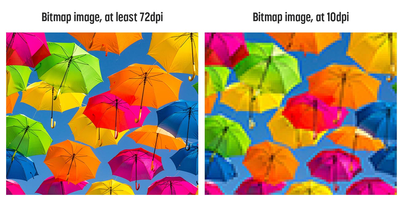
When dealing with bitmap images, it’s helpful to know about DPI and PPI. These literally are Dots Per Inch and Pixels Per Inch. As you would expect, these are the number of dots per inch of a printed image or pixels per inch of an on-screen image. The terms DPI and PPI are used interchangeably, so 72 DPI is essentially the same as 72 PPI when we’re checking the resolution of an image. The important thing to remember is each of those dots or pixels contains one colour, and the more of them there are, the clearer the image is.
The optimum resolution for images to be shown on screen is 72 DPI and for print, it’s 300 DPI. That big difference in optimum resolution is why a lot of images taken from the internet may not be big enough, i.e. have high enough resolution to be used in print. And not to mention potential copyright issues too – so our general advice is don’t just pinch something online!
If the resolution of an image is too low, i.e. the DPI is too low and therefore the dots or pixels per inch is too low, the image can appear blurred or pixelated.
Urgh, I don’t want my images to look like that! So how do I know if my image is big enough?
A really rough rule of thumb is that the larger the file size, the more information and therefore more pixels are in the image. If your file is less than a megabyte in file size it’s unlikely to be large enough to print on a pull-up banner, for example.
If you want a more accurate answer, you need to know a little bit about how to get the information from your computer and be ready with a calculator to do some maths.
If you’re using a Mac
- In Finder, right-click (or control-click) on an image.
- Click “Get Info.”
- Under the “More info” tab, look for Dimensions.
- You should see a number like “1024 x 768”. These numbers show the number of pixels in the image (width x height)
If you’re using a PC
- Right-click on the image icon.
- Click “Properties.”
- Click the “Summary” tab in the properties window.
- You’ll see values for the Width, Height, Horizontal Resolution and Vertical Resolution.
Now for the maths bit. If you’re wanting to print the image, you’ll need to divide those measurements by 300 (because 300dpi is the optimum resolution for print).
For example, an image 1500 x 1200 pixels will print at:
- 1500 pixels wide ÷ 300 dpi = 5 inches
- 1200 pixels wide ÷ 300 dpi = 4 inches
- Your image will therefore print at 5 x 4 inches.
Oh no, my image is too small! What should I do?
If the resolution is too low, don’t “stretch” the image by opening it in image editing software and enlarging it. It will create a pixelated effect.
If the image only needs to be made a tiny bit bigger, your designer may be able to work with the image but this is generally not recommended.
However, if the image is really far too small, unfortunately, this means it can’t be used as the data in the image just isn’t there. But don’t panic, there are other options!
- You could look for another image you hold the copyright for.
- Ask your creative for help. At Studio Bifrost, we can use stock image libraries or commission a photographer for replacement images.
- Does the image even need to be a bitmap image? If your image has a lot of flat shapes, e.g. it’s a diagram or logo, can your designer recreate it?
- Depending on what the image is needed for, it may be that the design can be reworked so the image is no longer needed and something else visual is used instead. As above, ask your creative for advice.
A partnership made in heaven?
Feeling inspired? We'd love to help! We are a team of collaborators that enjoy nothing more than partnering with ambitious clients. Get in touch if you'd like to talk through your next project or get some advice.