Things we love


It's always tough to pick out my favourite designs, as I find so many different projects inspiring. When choosing what to include in this article, I realised I couldn't possibly rank them against each other as a lot of the projects are not comparable. A rebrand is a different project from a full branding piece and is therefore wildly different to a record sleeve design or a single logo design. I've therefore ordered these loosely in the chronological order in which I saw them.
I'd love to know what you think about each of these pieces and what else caught your eye in the last year. Drop me an email using the form at the bottom and let's chat!
A lot of branding work is about marrying together two different values or concepts to produce a unique identity. Innovation with traditional values, reliability with flexibility for example.
Morphy Richards' new branding does this by following the ethos of‘ Happiness Engineered' and keeps the parts separate while still producing a very cohesive whole. Designed by Otherway, the visual identity represents the founder duo of Donal Morphy, a product engineer, and Charles Richard, a salesperson. Otherway worked with lettering artist Alec Tear to produce two custom typefaces, each representative of the founders and their vision to merge form with function. The logo showcases these new typefaces beautifully. Morphy is a clean, structured sans serif, while Richards is a warm, curved serif. I adore the curves of Richards! They feel nostalgic without being twee and add a touch of personality and flair.
The packaging showcases this marriage of two halves further by splitting the packs in half. One side shows white line illustrations on a rich blue background – evocative of blueprints and linking to the brand's pursuit of functionality. The other side shows photography on a clean, white background.
This concept of two halves follows through into advertising with the product on one side to represent form, and food on the other to represent the function and evoke warm feelings on the other.


16 years after their last refresh, while still recognised as one of the world's most famous ice cream brands, Baskin-Robbins' branding was looking pretty dated. US agency ChangeUp was commissioned to give the brand an overhaul.
The result is cleaner, more modern and frankly, much yummier. The 31 (paying homage to the 31 flavours they launched the business with back in 1945) still features prominently in the logo. It now is cleverly merged with the B and R, set in a chunky slab serif typeface.
I adore the colour choices! The blue and pink have been refreshed to become more vibrant, with a rich chocolate brown to complement. I don't know if it's intentional but the pink, brown and white remind me of Neapolitan ice cream. What a delicious project!

This branding for tree-planting browser extension app Freetree definitely has the fuzzy, feel-good factor. Freetree takes a small commission from online retailers when people shop with them, using that money to plant trees. Designed by How&How, the branding has been created to reflect the warm, fuzzy feeling people get when experiencing nature and contributing positively to the environment.
The cursor-tree icon is a clever focal point, while the personified trees definitely add to the cute factor. Champ is the primary typeface and was chosen for its chunky shapes and bouncy personality. The colours are natural yet contrasting and vibrant. The overall look is lush, warm and fun. Perhaps I'm just a big kid, but I love the happy little faces on the trees the most!


You may remember this one from my post The beauty (and pain) of record collecting. It's still my favourite record design in my collection at the time of writing this post. While the album itself was released in the autumn of 2021, I didn't receive the vinyl until May 2022, due to worldwide vinyl production backlogs.
When I did finally receive it, my socks were blown off with the design's glitchy details and chopped-up textures. Like me, Oxidized's designer Mitchell F. Gillies is influenced by The Designer's Republic and austere, corporate design so it's hardly surprising his work struck a chord with me.
I love this design so much, I made a cake depicting the album cover (far right in the images below with the record sleeve above it) to celebrate my anniversary with my partner (who is also a huge fan). Yes, I am an idiot – it took ages to cut all those little white pieces of icing out – and a slushy mare! Both Mitchell and the guys in Frontierer have been hugely complimentary of how I executed the cake, but the credit goes to them for inspiring me with their excellent work in the first place.

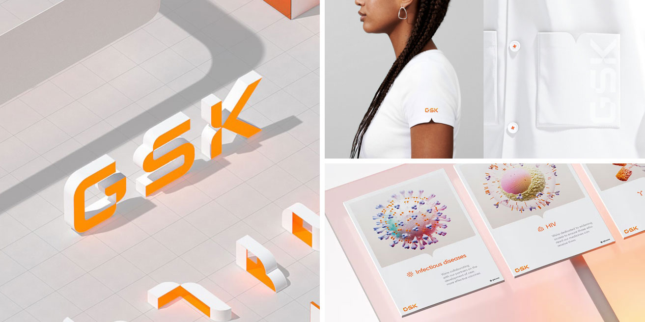
Working with branding giants Wolff Olins, pharmaceutical company GlaxoSmithKline rebranded as GSK. The new look includes an updated logo (complete with 3D and animated states), bespoke typeface, and motion assets.
The aims were to balance innovation with warmth, which is why curves and vibrant orange gradients are focal points. The curved shapes in the logo and elsewhere in the branding give a sense of flexibility and movement.
Clearly, a lot of care has been taken which is evident in the details such as on the clothing. I feel this is a masterclass in corporate branding.
Now for something completely different! My partner bought me this beautiful deck for my birthday, in response to my growing interest in tarot reading.
Regardless of your beliefs on tarot and divination, you can't deny the time and skill that went into creating these detailed pieces. I've always loved the colour combination of black, red and white, which I think is what caught my partner's eye when he found these. They're undeniably gothic and surely influenced by the iconic work of H.R. Giger, whom I am also a fan of.
The choices of symbols for the minor arcana are quite intriguing, for example, egg timers for the cups suit (traditionally relating to emotions) and keys for pentacles (signifying practical matters including material wealth). They have sparked my imagination around symbology not just in tarot cards but in logo and icon design.

Until this rebrand by Collins, the 110-year-old organisation had let its 112 independent councils design their communications. Bringing it all together into one, cohesive identity was no mean feat and the work took three years.
Collins updated the trefoil and added a nostalgic feeling serif typeface. However, the look has been brought right up to date with a vibrant, rainbow colour palette and a range of different shapes and symbols supporting the logo.
I think the result displays an excellent balance of history with modern values. It feels inclusive, diverse, energised and wholesome. The look is flexible, giving plenty of space for variation and allowing the branding to feel fresh without losing its identity.


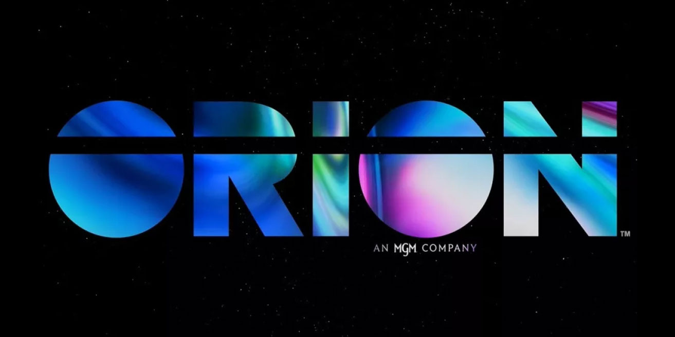
Choosing when to update a logo and how far to go can be very difficult, especially for a brand as established as Orion Pictures. If you change too much, you run the risk of losing brand recognition. Not refreshing things enough might result in looking like the brand is stuck in the past.
Orion Pictures' new logo treads the line between respect for company history with a fresh new look perfectly. The line running through parts of the upper case capital letters now goes all the way through the whole word. The sans serif font has been updated to a cleaner, more modern choice. The biggest change is the addition of the neon gradient. This is in line with the vaporwave trend, yet the logo still looks professional and adds a sense of movement and depth.
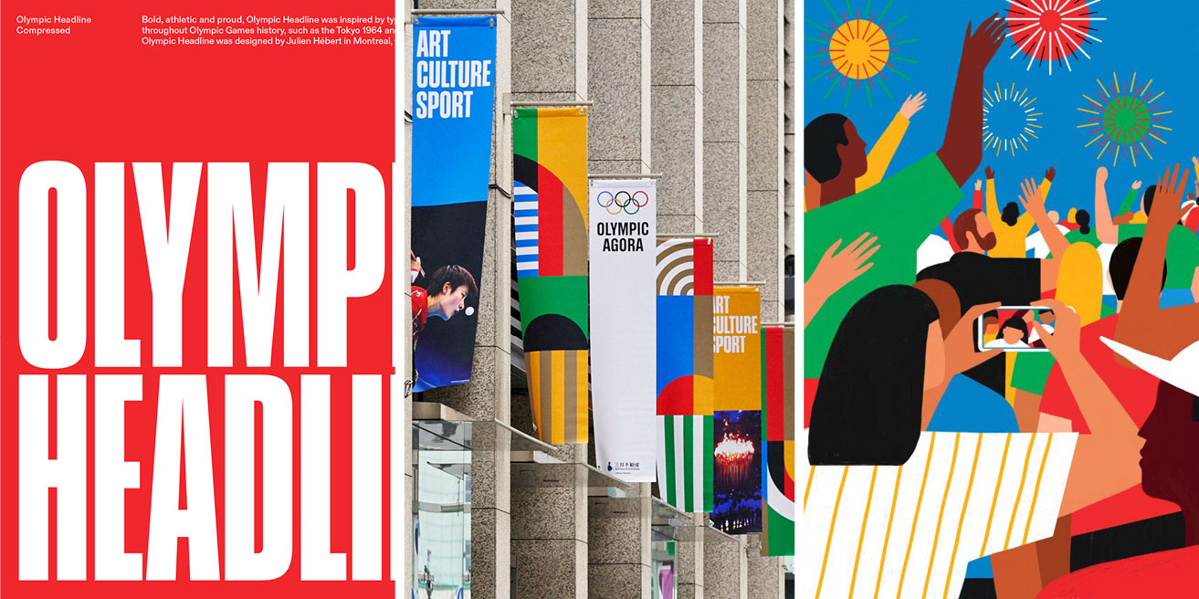
I was really surprised to read that the International Olympic Committee had never had a solid branding identity until now, despite presiding over so many Olympic events with iconic styles over the years.
Canadian creative agency Hulse & Durrell produced custom typefaces, graphics, and illustrations along with a full branding guidelines document. The aim was not to create something completely new but to evolve what had gone before into a more consistent identity. They called in Fabian Harb and Seb McLauchlan from Dinamo and Julien Hébert of Principal to design the custom typefaces. Artists Francesco Ciccolella, Abbey Lossing and Karan Singh were commissioned to work on the illustrations.
Some of the updates included subtle changes like keeping the Pantone colours for the 5 Olympic Rings the same but adjusting CMYK and RGB values so they work better in print and digital outputs. The custom typefaces and new illustrations are some of the more obvious changes and highlights.
Olympic Headline is just so perfect as a feature typeface. It evokes the best of the past Olympic branding but feels clean and modern at the same time. It's so effortlessly timeless, especially when combined with the illustrations and other typefaces. I love how the colours have been used to create bold, blocky patterns. They are so eye-catching and add another timeless element. I can't wait to see this identity fully rolled out in time for Paris 2024!

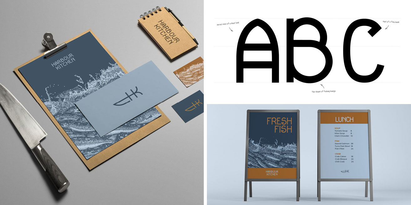
I enjoy design that cleverly combines two elements into one, partly because it's usually not that easy to do. The logo in this Outer Hebridean seafood kitchen manages to combine four! It's a monogram derived from the initial H and K but it is also a fish and a knife – yet it's still very simple with each element clearly recognisable.
The excellence in this branding work, by Pearse O'Halloran, doesn't stop there. There's a custom display typeface inspired by Hebridean culture, beautifully detailed linocut work by local printmaker Alice Macmillan and a rich colour palette of blues with a warm terracotta. The overall look is rustic yet modern and very distinctive. Gorgeous!
Feeling inspired? We'd love to help! We are a team of collaborators that enjoy nothing more than partnering with ambitious clients. Get in touch if you'd like to talk through your next project or get some advice.