Things we love


One thing I can always guarantee about visiting any tourist attraction with a historical element is that I will be found drooling over vintage typography and graphic design at some point.
I’d suggested the RAF Air Defence Radar Museum for my primary school-aged boys obsessed with weapons, explosions and war. And yes, I have got some funny pictures of them standing next to missiles looking particularly crazed! We also discovered my eldest is incredibly good at tapping Morse Code (which the rest of us found surprisingly difficult). My partner is a music producer and he enjoyed exploring all the old consoles from different periods in the RAF base’s history. I did too. So many knobs and buttons to press! The Cold War room is something to behold. It contains rows of consoles and a big screen at the bottom, which reminded me of the 1983 film WarGames. It brought both my partner and I chills to understand the power the people in that room had when it was fully operational.
However, I digress. It was a good visit for many different reasons but part of it for me was all this lovely vintage design.


Initially, I was struck by the lettering on the consoles and equipment. The image on the left was taken while I sat in a Jaguar cockpit, which was surprisingly small. I did feel that it was incredible such a small craft would go so far up in the air and carry weapons… I’m not great with heights so I probably wouldn’t have made a good pilot!

I didn’t quite work out what the apparatus on the left is for (it happens when you have two energetic primary school-aged boys with you!) – I believe something to do with plotting courses for aircraft. But I find these kinds of things very tactile with the discs you can spin. I think probably because it’s a marriage of design with maths – and my two best subjects at school were art and maths. I like the logo lettering of the Universal Avometer on the right. The curves form an unusual shape, especially when combined with the M in the middle.

I was inspired by a lot of small details, like the angled top of the stroke for the number one of the clock and the W and R of the weatherboard. The Post Office Engineering Department sign has so much vintage charm. Firstly, it’s hand-painted, as the letters are not the same – for example, compare the Rs. Secondly, there are a lot of unusual features, like the ends of the C being different. The central curve of the S is unusually flat for a condensed typeface, which forces the character to be wider than the other letters.
Side note: I wanted to be a sign painter when I was at school. My parents dissuaded me saying it’s a dying art. They were probably right to be honest although I imagine it’s enjoying a revival now with increased interest in old-fashioned styles. I felt like being a graphic designer was the next best option as I still get to play with lettering!
The Marconi sign struck me as timeless in design. You can still see logos being designed in a very similar way today.


Like a proper type nerd, I spent a bit of time pondering how the lettering had been applied to the signage and equipment as that has an impact on how consistently it is executed. Most of it was inconsistent because, as I’d expect for the period it was created and for the purpose, wouldn’t have been printed from a computer. The board on the left with the beautiful serif lettering, I think would have been hand-painted. I think the same applies to the tally board on the right. However, the board in the middle would have to be updated regularly but it is more consistent. I believe stencils were used to create those open, geometric forms and bring some regularity. However, the human elements that produce the inconsistencies in all these examples make them much more warm and engaging. This is why hand lettering and customised typefaces have been, and continue to be, very popular.

Photography was much more expensive to use during World War II than the current day, as digital means had not yet been invented. Illustration was therefore commonly used, as demonstrated in these posters. The poster on the left is quite clever in concept. Hitler’s arm resembles a panhandle and the illustrator has cleverly made his infamous hair from a piece of pastry. I quite like how they’ve exchanged Churchill’s trademark cigar for a spoon!
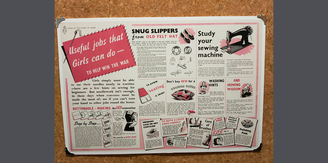
I could not help but laugh at the rampant sexism in this and the poster below! I know, it was commonplace back then, and much has changed, although sadly still not enough for true equality. These two posters serve as a good snapshot of how gender roles were perceived back then, demonstrating how graphic design can be useful in historical contexts.


I did find something a bit surprising about these two posters. Broadly, they show how roles were split between men and women, with men expected to do the DIY and women left with the ‘softer’ tasks like cleaning and sewing. I, therefore, thought it was a bit unusual to see instructions for sewing on buttons and darning on the poster for boys. This shows attitudes were starting to change, even then.
Something else to note in wartime print design is the limitation of colour. The advent of digital print has meant the cost of full-colour printing has dropped enormously. Before this, when working with traditional printing methods, it was much more common to see one or two-colour printing which is lower in cost than full-colour on lithographic printing presses. It’s therefore not surprising to see most of the posters have not been printed in full colour, given that this was a time of rationing.
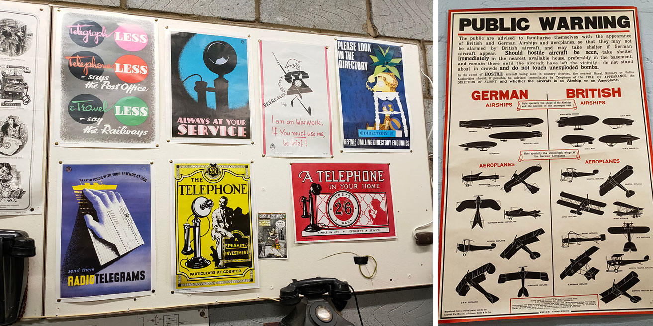
I like the range of typefaces here. The chunky sans serif on the poster on the right is gorgeous. I would use that now in a design if suits the client and audience! I particularly enjoy pairing typefaces so love to see unusual examples. For example, I wouldn’t have thought to combine the script in the Telegraph Less poster in the top left, with the chunky and characterful serif. It does work, although I think it does need to be in a design where typography has the focus.

These packaging examples show how little some brands have moved on. Brasso, Colman’s Mustard and Oxo have stuck to their heritage. Their current packaging looks almost identical to those shown here. This demonstrates how long the brands have been going and brings a sense of trusted nostalgia. For this reason, in recent years, we’ve seen a rise in brands rediscovering their roots by taking inspiration from their past. The swirls on the sugar and Pontefract Cakes times are beautiful. This style has inspired a lot of the vintage look that is popular now.
The flash on the ration chocolate stating “When extra work needs to be done, use your ration to keep going strong” made me chuckle. Given how much nutritional science has moved on, I can’t imagine that advice now!

I do love the angled serif typeface on the Make Do and Mend leaflet here. This is another example of a style from the past that is enjoying a resurgence in popularity now. I found the cigarette packaging here really beautiful. It’s a far cry from the minimal packaging we see now, complete with grim photography of what smoking can do to you and huge health warnings. Back when the packaging above was designed, people were unaware of the dangers of smoking. I believe it was even actively encouraged!


The ration book holder is a fantastic example of successful font pairing. The combination of condensed sans serif, with small sans serif and script underneath, is sublime. The Smith’s crisps tin label shows an interesting style you only see now if the designer deliberately tries to make the design look old-fashioned. The lettering has been forced into the shapes. I think it looks beautiful, but that style is surprisingly hard to successfully execute without losing legibility.
Feeling inspired? We'd love to help! We are a team of collaborators that enjoy nothing more than partnering with ambitious clients. Get in touch if you'd like to talk through your next project or get some advice.